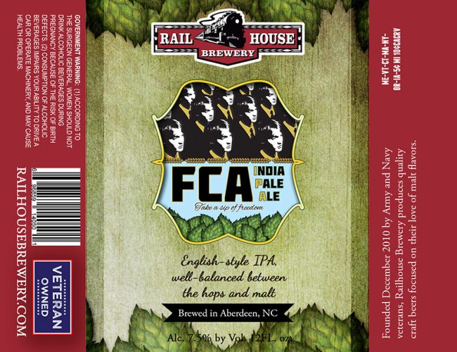
Railhouse Brewery released new packaging that hit North and South Carolina markets in January. Additionally, the Brewery has moved from Heritage to long-neck bottles.
The new designs are more colorful and vivid but maintain the main imagery of previous packaging.
The new beer labels also have more information for the consumer. Each beer label includes a style description to aid consumers in making their beer selection. The descriptions use a cursive font to give homage to the Brewery’s English-style beer roots.
Along with information on the company’s history, the packaging also includes a “veteran-owned” logo. “We are proud to be a veteran-owned brewery, and our Brew Pub proudly serves hundreds of current and former Army soldiers from Fort Bragg and Camp Mackall, as well as their spouses,” said Brian Evitts, co-owner and brewmaster. Railhouse will continue to use American flag bottle caps.
The new designs, created by military veteran Jackie Hurd of JMHurd Design (Southern Pines, NC), will appear on all brands and packages. Many of the elements are hand-drawn by Jackie, a graphic designer, artist, and photographer.
While the new bottle labels have already hit the shelves, new six-pack holders will be released in February.

Share Post